Institutional Green: Materialized, Sensorialized
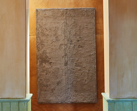
David Ireland is not often considered a colorist. In his work, Ireland used muted subdued tones meant to play with light, and sometimes would add a vibrant pop of red or blue. One such color, Battleship grey, coats the house’s exterior façade and is so innocuous that passersby could miss the structure nestled on the corner of Capp and Twentieth streets in the Mission district of San Francisco. Battleship grey becomes an unassuming nod to Ireland’s concerns regarding the hazy boundary between art and lived life. Institutional Green is another color present, in all of its lackluster glory, throughout Ireland’s home at 500 Capp Street, with stunning displays in the kitchen, the downstairs hallway, and the westward-facing view of the upstairs hall.
Institutional Green is a color you have seen elsewhere, most likely on the walls of medical institutions, used to ease “after-imaging” of surgeons who have spent hours in the red guts of their patients.1 “After-imaging” is a real phenomenon that describes what happens when you stare at a color for extended periods and then when looking away you see its complement. Hence, staring at the green wall of the surgical suite allows for quicker adjustment of the surgeons eyes back into “normal” vision. The color became so ever-present and overused due to misinterpretation and misuse of its practical applications, that designers have moved away from Institutional Green and conducted studies about colors best used in healthcare settings.2 It begs the question: how often have you seen this color, whether in film, photo, or the very real space of the institution?
Institutional Green gnaws on sense memory through its familiar vagueness, like a word that lingers on the tip of your tongue, never fully spoken. Within the house, doors, frames, and chairs are enlivened with this color by paradoxically drawing on its drab pervasiveness. Green is the color most perceived by the human eye, often in vibrant natural hues. However dissimilar to uses in hospitals, Institutional Green as used by Ireland plays on the sensory reception and perception of color returned to us within a space or site-specific work. The mundane ubiquity of Institutional Green calls attention to mechanisms of power inherent in the design and architecture of institutional space. Mechanisms that Ireland exploits in other projects using chairs, or concrete, or fiberglass effigies,3 that implore the viewer to question how they locate themselves within the walls of the work.
Saying color operates as a universal signifier or operative agent does a disservice to the power color has on individuals and their associations. Color has power, one we oftentimes fear because of deeply embedded significatory historical associations. For instance, in Western culture, the associations of black with evil and white with good, or in Eastern traditions, the association of red with marriage and happiness. The connection for Ireland to ‘Institutional Green’ draws on the power architectural space holds over the individual. In Ireland’s case, architecture had immense priority in his practice and daily life. Institutional Green, seen in this light, represents Ireland’s attachment to and use of the color employing the structures of belief built up around it.
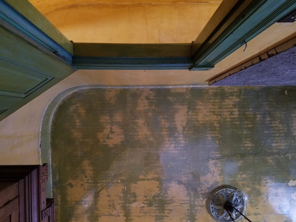
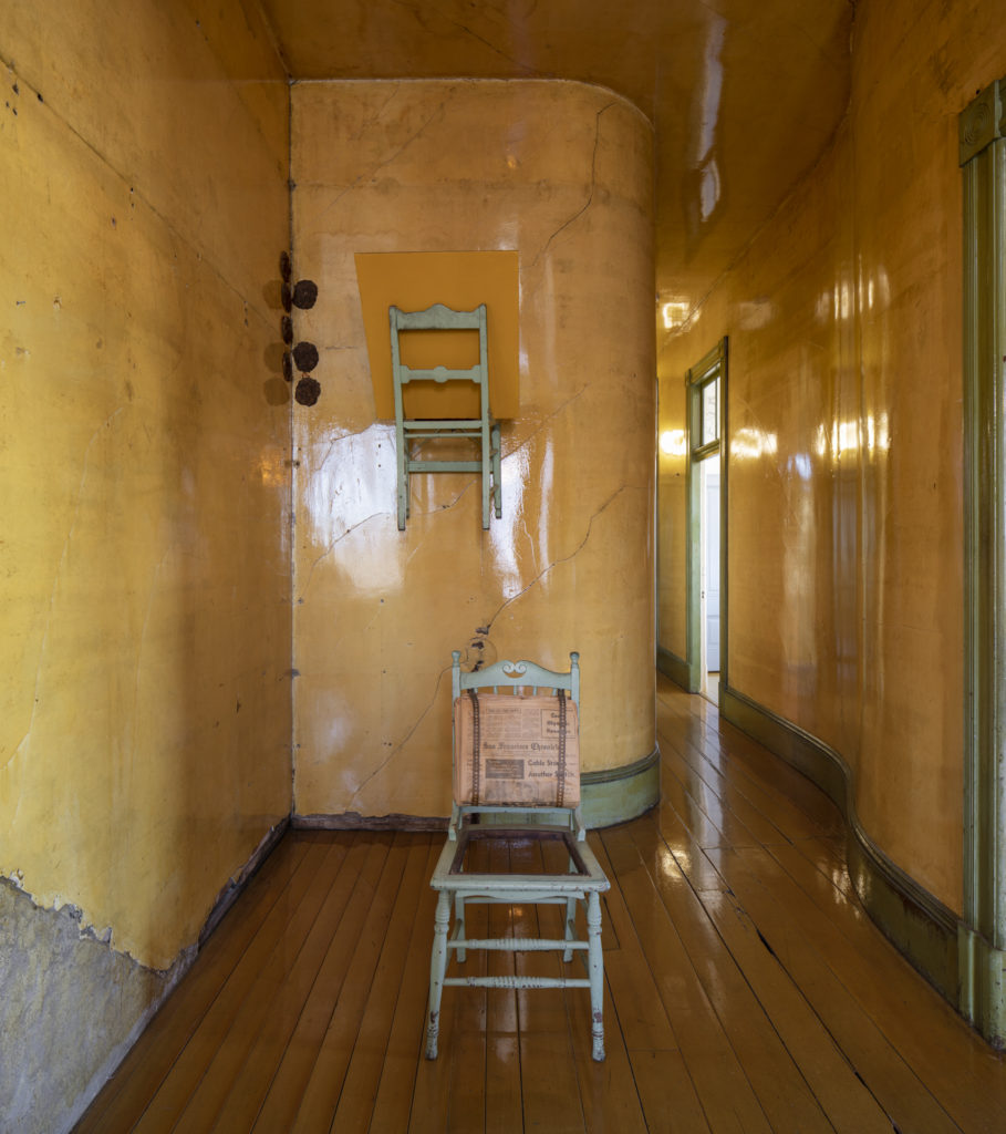
Unlike his Battleship grey, which was a cheap mix of leftover colors, Institutional Green was particular. The color was present in the home before Ireland acquired it, with remnants of older applications still present throughout. It captures the power of color as an institutional tool to transform a space and respond to the actors within it. When applied throughout the house, this green responds to the polyurethane-coated walls and floors, refracting the drabness of its hue in a way that glows. It makes present concerns of how space allows for perceptions of power to shift. In this instance, it softens and creates warmth; a perfect example is the westward-facing view of the upstairs hallway bathed in afternoon light. The yellow of the walls and golden floors sing in harmony with the solemn warmth of the doors, their frames, and the molding. It transports you to a place of curiosity, especially in the green of the untitled chair painting hung on the wall or the chair with newspapers bolted to its back.
These green chairs ask us to linger and reflect on the power that an object holds when it holds the body. They perform through inaction and absence. A body is not present but calls our attention to that fact through a semiotic relationship to the object that signs and signifies chair; think Kosuth One and Three Chairs, or Magritte’s The Treachery of Images. They ask us, like many of the chairs present, to question the use of the object in relation to the body and how these chairs perform as mediator for and within the experience. It exploits “the dialectic of wayward subjectivity and impersonal rootedness” of Ireland’s art that seems to encapsulate his oeuvre and asks us to question the transient nature of art and life.4
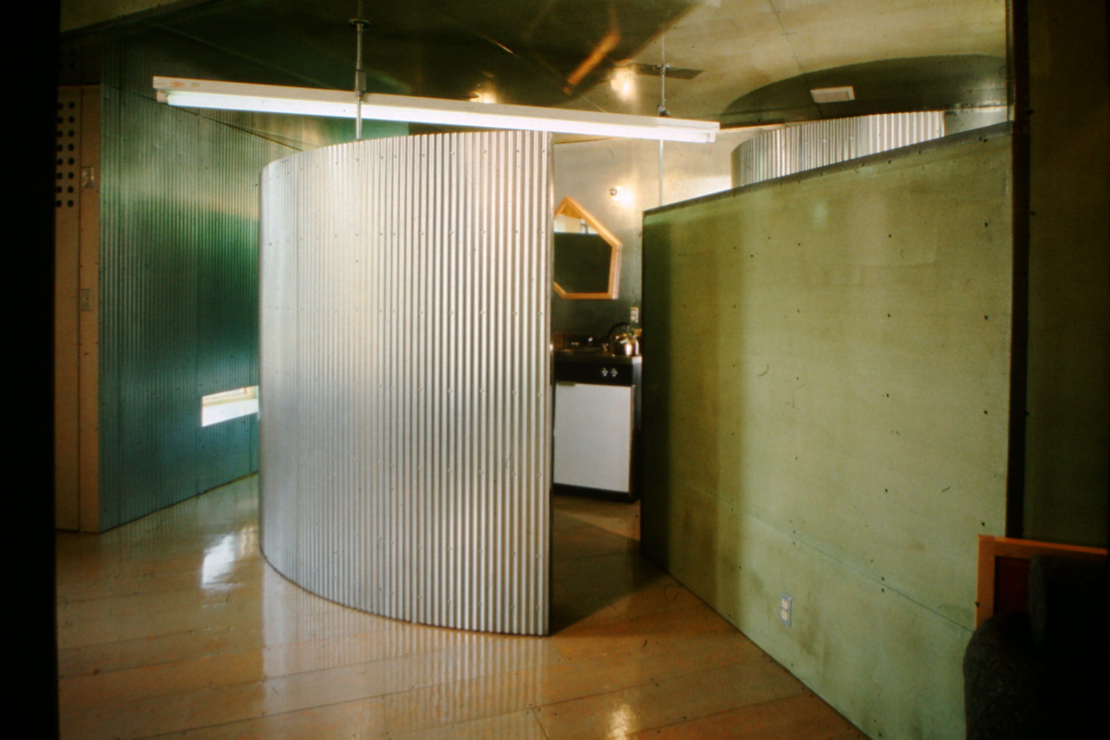
Not only present throughout 500 Capp Street, Institutional Green exists in other site-specific works that Ireland created throughout his life. One instance is in Washington D.C. at Jade Garden, which was an artist’s apartment that he and Robert Wilhite designed and produced in conjunction with the Washington Project for the Arts under the direction of Jock Reynolds.5 The unique feature of this location was not so much the Institutional Green covered walls. Instead, it was the walls of corrugated metal, one of which was curved. Within Jade Garden, Institutional Green operates on a different frequency than the humming glow at The David Ireland House at 500 Capp Street.

Corrugated metal and fluorescents draw out the blue within to produce a cool ambience and aura quite different from that of the house. It reflects the refracted light of the metal, imbuing a blue hue, cave like and inviting; in a way recalling rest or slumber that fits for a home. The institutional monochrome that is the wall requires stillness and asks us to spend time getting lost in it. Inversely, however, it is so mundane that this Institutional Green wall as a painting could easily get looked over and hum in the background of the monotony of day-to-day existence within this space. The color does not overpower, and it imbues stillness, perhaps in the same way that a color like “drunk tank pink” has on the over-intoxicated. This use of color reveals the poetics within Ireland’s work that require us to sit with the minimal use of a material to its maximum effects and affects, a skillful gesture that carries through Ireland’s oeuvre like the molding throughout the house.
- “What is the Next ‘Institutional Green?’” 2005 https://www.healthcaredesignmagazine.com/architecture/what-next-institutional-green/ [↩]
- See the C.H.E.R. Color in Health Care Environments study produced by the Coalition For Health Environments Research at https://www.healthdesign.org/sites/default/files/color_in_hc_environ.pdf [↩]
- For instance one thinks of Ireland’s 1996 piece entitled Angel-Go-Round that employs fiberglass angels, one of which is suspended in the air above and rotates using a lawnmower engine. Viewed here in a 2016 video by SFAI in conjunction with the exhibition David Ireland in the Walter and Mcbean Galleries and the public opening of The David Ireland House at 500 Capp Street. [↩]
- Kenneth Baker “David Ireland: Nothing Ventured” in David Ireland: Sculptures, Paintings, Drawings (London: Ridinghouse, 2008), 7. [↩]
- Constance Lewallen, 500 Capp Street: David Ireland’s House (Oakland: University of California Press, 2015), 81. [↩]